
Most tile decisions get made the way paint colors do: In a showroom, under fluorescent lights, with a small sample in one hand and a vague feeling in the other. Then the room is finished, and the tile turns out to be the first thing everyone notices and the one thing nobody wants to redo.
Tile covers more surface than almost any other material in a kitchen or bath. It handles water, heat, grease, and daily foot traffic, and it sets the tone for everything around it. At LBK, we treat every tile selection as a design decision and a performance decision at once. Here is how we think it through, room by room, for homes across Bucks County, Montgomery County, and Philadelphia County.
The short version: choose porcelain where water and traffic are heaviest, size the tile to the surface it covers, and treat grout color as part of the design rather than an afterthought.
Kitchen Backsplash Tile: Where the Personality Lives
A kitchen backsplash is the one place where you can take a design risk without betting the whole room. It sits at eye level, catches the light from under-cabinet fixtures, and protects the wall behind the sink and range, so it must look good and wipe clean. Our general approach is to let the cabinetry and countertops carry the weight and let the backsplash add texture.
In a recent Jamison kitchen, a soft gray herringbone became the feature behind the hood. In a New Hope kitchen, a light porcelain subway-style tile in a brick pattern, finished with metal edge trim, kept the palette quiet and the lines crisp.
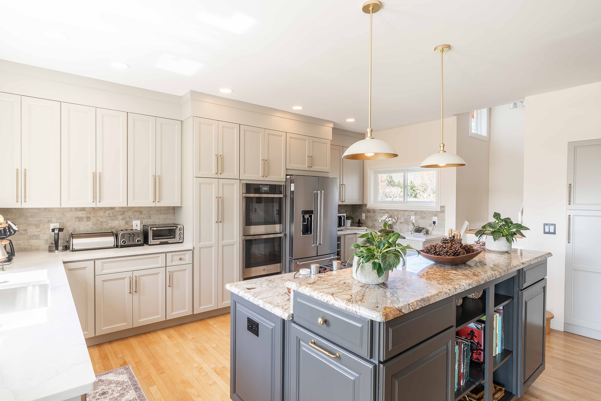
A light porcelain subway-style tile in a brick pattern, finished with metal edge trim, keeps the palette quiet and the lines crisp in this New Hope Kitchen.
Kitchen Floor Tile: Built for the Daily Grind
Kitchen floors take spills, dropped pans, and the steady parade of a family that actually lives there. Porcelain in a matte or lightly textured finish is our usual starting point because it resists staining, hides everyday dirt, and grips underfoot. Larger formats such as 12×24 mean fewer grout lines to clean. That said, tile is not always the answer. When existing hardwood is in good shape and flows into adjoining rooms, keeping it can be the smarter design and budget decision.
Bathroom Floor Tile: Safety First, Then Style
Choose a bathroom floor tile for how it behaves when wet, then for how it looks. Look for porcelain with a wet dynamic coefficient of friction (DCOF) of 0.42 or higher, a common industry benchmark for slip resistance, and favor matte or textured finishes over polished ones. Hexagons and other small-format mosaics add traction through extra grout lines, while large-format matte tile gives a calmer, more spa-like surface. Bathroom tile is also the natural partner for radiant floor heating, a welcome luxury on a January morning in Bucks County.
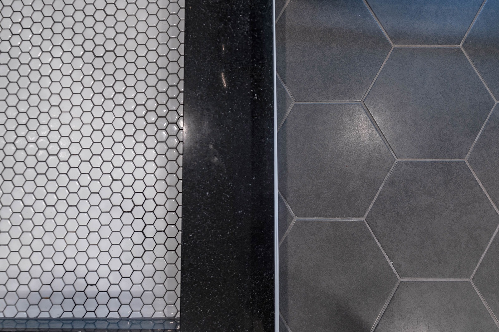
Choose a bathroom floor tile for how it behaves when wet, then for how it looks. Hexagons and other small-format mosaics add traction through extra grout lines.
Shower Wall Tile: Scale, Sheen, and Fewer Grout Lines
Shower walls are where tile earns its keep, and where logic should lead. Behind every beautiful shower is a waterproofing system you will never see, and it matters more than any tile you choose. On the surface, larger formats and vertical stacks mean fewer grout lines to scrub and a ceiling that feels taller, while a glossy glaze bounces light around a small shower. Classic subway tile still works beautifully with the right twist.

Our Doylestown master bath pairs a deep blue glossy porcelain subway, laid in a 50/50 horizontal pattern, with a calm neutral palette so the shower feels deliberate rather than busy.
Shower Floor Tile: Small Tile, Big Traction
A shower floor has to slope toward the drain, and small tile bends to that slope in a way large tile cannot. Mosaics and tile under about four inches, such as hexagons and penny rounds, follow the pan and add traction through their grout lines. It also gives you a chance to let the shower floor quietly differ from the bathroom floor. In that same Doylestown bath (above), a white hexagon porcelain mosaic in the shower sits beside a warm gray matte hexagon on the main floor, so the two spaces connect without competing. Whatever you choose, confirm the slip rating before you fall in love with the look.
Grout Color: The Decision That Changes Everything
Grout is the frame around every tile, and it can change how an entire surface reads. Matching or tone-on-tone grout makes tile feel seamless and lets large formats and subtle color take center stage. Contrasting grout, such as charcoal against white subway, turns the layout into a graphic pattern, which is why it shows off herringbone so well. On floors, a mid-tone gray or warm greige hides dirt far better than bright white. Always view grout samples next to your actual tile, because color can shift as it cures, and ask about stain-resistant grout for showers and other wet areas.
Mudrooms, Entries, and Laundry Rooms: Tile That Works Hard
Hard-working rooms deserve tile that can take it. Mudrooms and entries collect boots, snow, and salt through Pennsylvania winters, so durable porcelain with a textured surface is the practical choice. It is also a chance to be playful.

A gray herringbone floor in a New Hope mudroom gave a utility space a contemporary feel without giving up durability.
The LBK Way
At LBK, tile is selected early, in the design phase, alongside cabinetry, plumbing fixtures, and lighting, because those choices depend on one another. The size of a tile affects where a niche lands, how a pattern turns a corner, and how much grout a room has to live with. Because we design and build under one roof, the team that helps you choose your tile is the team that prepares the surface, installs it, and stands behind it. For more on how layout changes the way tile reads, see our Pattern Play guide, and for a closer look at materials, see Exploring Tile and Stone Variations.